|
Best viewed at 800x600 or greater resolution. Set your browser to at least the width of the " frame" around the text area.
And, from the viewer's point of view, the way their browser and system are configured has a lot to do with whether what they are seeing is anything like what the designer intended. OK, So here's our essay
. . .
Some
Thoughts on Web Page Standards
 Here
at C-NPR, we've spent a lot of time reviewing popular sites, and we have
developed a series of standards we believe create the most useful mix on
the largest number of browsers. Here
at C-NPR, we've spent a lot of time reviewing popular sites, and we have
developed a series of standards we believe create the most useful mix on
the largest number of browsers.
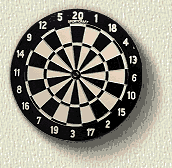
In other words (like with darts), we go for the big middle. That said, here are some
of the standards we (and a lot of other web page designers) tend to start
with -
Macintosh - 12 pt. for Netscape and either Small or Smallest for Explorer of 800 pixels wide for the screen design. "Where does that leave all of us with rudimentary systems still running 640 pixel wide screens?" they could say. Well, they're right; web pages designed to our standards will be tough to see on a minimal or incorrectly configured system - graphics will run off the screen or not load right, word wrap will clunk up text, and the page won't look very pretty, certainly not much like the designer intended. Our decision is a simple one - try to be backwardly compatible but assume that more and more people will have appropriate systems as time goes by. And the truth is, these are conservative standards that will be OK for the next couple of years, but they'll be obsolete too. Like we said at the top,
here, we shoot for the big middle - where most of us are.
Animation - or "Time is Money"  We
love movement, we love animation. After all, C-NPR's principals come from
the corporate and broadcast video world. We usually get antsy
whenever we produce a video where a scene goes more than 5 or 6 seconds
without a cut-away. So why do our web pages typically avoid dancing
ants, buttons that vibrate and move about, large graphic backgrounds, or
other such popular items? We
love movement, we love animation. After all, C-NPR's principals come from
the corporate and broadcast video world. We usually get antsy
whenever we produce a video where a scene goes more than 5 or 6 seconds
without a cut-away. So why do our web pages typically avoid dancing
ants, buttons that vibrate and move about, large graphic backgrounds, or
other such popular items?
There are a couple of reasons -
What we try to do in developing animations is to create an animation that is physically small or one that has as few steps in it as possible - or both. Each of these considerations helps limit the file size of the finished element and that translates directly into how long it takes to download and display in some person's browser out there in what's laughingly referred to as cyber-space. The "On-Air" animation, for example, is a simple two-step animation. We even created it with a master background (the un-lit sign w/box) and then built the second step with only the lit sign field (sans box) positioned properly over the first element. That saved a few more bytes since the second step didn't have to download the part that the first element (the overall graphic) already put into the browser's cache. To see the "On-Air"
animation box click here To see yet one more interesting animation we
created for one of our client, something we call Fill
the Piggy-Bank, click
here For the sake of this discussion, we also created a "sand-storm"animation out of the Soho Center's CHILD/2000 logo (which we designed for them). The effect is somewhat trivial - a logo builds up out of random dots until the whole logo is complete. The effect happens in 20 discrete steps - each of which has to first get to you and your browser. The 20 steps take about 3 minutes to download if you have a 28.8 modem and a good server. Once it's all loaded it runs repeatedly from your cache. To see the Sand
Storm Animation effect (and see how much
longer something like this to download), click here To give you a sense of the differences between these two examples, the "On-Air" animation is 29,061 bytes in size and the CHILD/2000 animation is 455,210 bytes. That makes it about 15 times as big - and (as you now know from the wait) it will take about 15 times as long to download. Which gets us back to the point we're making - if you wanted a complex animation element on your page, it had better be worth (in this case) 15 times as much - because you're asking your viewer to hang around 15 times as long while your animation is making its way from your server to their browser.
We upload everything to our server, clear our system cache, and call up the site we're building. It's a sobering thing to see what the rest of the world has to put up with to get to the "jewels" - it's something more designers and more clients ought to do. Here at C-NPR we get to the web with a very standard Hewlett-Packard 266 mHz Pentium II machine with 64 MB of RAM, a 3Com 56k modem (that only runs at 45.3k because of our rural phone service), and both Netscape Communicator (Version 4.74) and Internet Explorer 5.x browsers. There are sites whose home pages take over three minutes to load - and we have a fast server! If that's the sort of site you want to build, OK - but you better hope your potential visitor REALLY wants to see what you have to say - and forget snagging the casual drop-by. More thoughts some time soon . . .
|
 No
t e s w e
d i e f o r . . .